Notes on Looking
Chris Lipomi and Georg Parthen at JB Jurve
Posted on October 20, 2011, by admin
Text message, 9:35 pm on Saturday, October 8, 2011 Geoff Tuck to Chris Lipomi:
“Is JB Jurve still happening? We just shooed people out and want to come. Geoff”
Chris Lipomi to Geoff Tuck, moments later:
“Yes!”
Geoff Tuck back to Chris Lipomi, instantly:
“Yay! Well leave now”
From home see u soon”
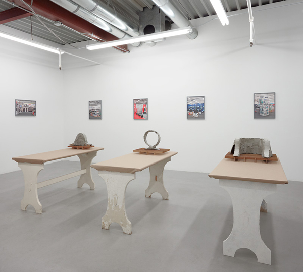
Somehow I looked at the photographs first, I think Chris Lipomi’s sculptures made me nervous. The party seemed to be on the roof so D and I had the place pretty much to ourselves – the windows out onto Broadway might have been open and we may have felt a breeze stirring. When I looked again at the sculptures it was as though that breeze that unsettled me set the tone for my looking. I had the curious sense of watching myself see the work and seeing how I drew connections between Parthen’s sculptural-looking photographs and Lipomi’s totemic, hand-made Modern tombstones.
Backing up a bit, I thought of several railroad tie sculptures That Chris Lipomi has made in recent years – one that he showed at Mihai Nicodim in the spring of 2010 titled Platform. http://nicodimgallery.com/exhibitions/a-harmonious-mix-of-objects/ In his studio, Lipomi has a suite of maquettes for similar sculptures made of railroad ties and built in varying degrees of complexity, and these he displays on a wood-grain plastic surface table – the type with metal tubing legs.
At Jurve Lipomi is working with concrete to make his objects, and he has double plinthed them. Each sculpture sits on a metal grid and this grid is placed on the aforementioned rough table, which is itself covered in brown wrapping paper. Several are the conflicting or complementing types of removal and presentation in this space.
I keep getting stuck, fascinated even, with that brown paper wrapping. It reminds me of the railroad ties that the artist has used – each has a ubiquitous quality: paper wrapping is everywhere, and everywhere that it is it is always the same. Rough, brown, blackened with creosote and use, wooden railroad material also becomes all the same when you try to separate one out from among the rest. Each of us has at one time in a past made bookshelves from this easily obtained material – usually paired with concrete masonry blocks. Each of us also has probably, later on in life perhaps, made garden terraces or vegetable growing boxes with the ties.
Commonplace materials of production. Precision of presentation. Idiosyncrasy of form.
There is a sense of the social to this work too, as to Lipomi’s past projects. Sometimes this social aspect presents as literal activities of a body – the railroad tie sculpture Platform which invited you to climb up and view the exhibition and the social interactions surrounding the exhibition. For Makawana Omawaki, Chris’s 2006 exhibition at Dan Hug in Chinatown, the artist made ‘tribal’ looking masks, hanging plant boxes, paintings, and mirrors all of which filled the gallery to a cheerful claustrophobia and looked to me like the 1975 dude-aspiring-to-suave-debauchery bachelor pad of an older acquaintance in Diamond Bar when I was a teenager. (We kids could smoke weed, listen to Queen and hang with adults. It was magical disarray.) Although this exhibition began with a ritualistic installation of the final sculpture accompanied by a Chinatown bacchanal, when I visited ‘the body’ was not present in Lipomi’s show and the gallery was empty. Still – social activity was certainly implied in that space.
This reliance on and investigation of social inclusion in his work continued with a 2010 show At Michael Lett in New Zealand, Interactive Visual History Compression (The Ks), for which the artist/curator reached into his curatorial tool kit and pulled out the alphabet as his organizing principle. In this case a society is constructed by selecting artists whose last name begins with the letter ‘K’. http://www.michaellett.com/exhibition/?show=168&s=Interactive+Visual+History+Compression+%28The+Ks%29
And where is the body in this present show? How do these newer sculptures relate to social activity? Um, let’s see. Sitting at the table, before it became a pedestal? Perhaps praying before the hallowed ground that the table-tops and the sculptures resemble? Waiting for the dawn to praise the new day upon a grave of the day before?
And because I have done this, I see ghosts of conversations past, of people standing around a table in the artist’s studio, discussing the work, exploring possibilities for fun on the internet, comparing notes on popular music and somewhat ostentatiously parsing theory draped around recent art history. And then coming out from a daze of conversation to find a changed atmosphere, these wrapped surfaces and rough concrete sculptures and feeling a little bit amazed but also open, as though these objects, as odd as they are, exist already as ideas even as I see them for the first time.
Georg Parthen’s photographs have a similar instant recognition quality to them, as well as the feel that they are also sculptures. We have all been to electronics stores and we have all been confronted with cheerful, emphatic, promiscuous stacks of objects that promise much, and as functioning objects deliver entry to a psycho-emotional conveyance in which we travel through anticipation, negotiation, elation and satisfaction and then obsolescence and so back to anticipation. No happy ending here, simply constant arousal.
Their objectness certainly includes the things imaged: boxes, printed with commercial slogans and pictures of accessories often resemble sculpture; also the photos themselves, which have saturated, punchy colors and a chunk-like three-dimensional feel in person, act as objects for me. They take up more room than typically I allow for a flat photo in a frame, hanging on the wall. Maybe because these are small enough for me to hold, maybe my hands join with my imagination in wanting to feel their boxy presence with my fingers – if these were printed huge I would identify less with them and would feel more the idealizing and the unavailable and less the human.
Parthen manufactures his pictures from the among most successful bits of several initial photographs, thus making an ideal situation – yet one that feels eminently real. I can place myself within these images, I swear that I have been in these exact places. I feel slightly shabby standing before them but it is a shabbiness that does not exactly put me off. They, and others of the artists works that I saw on the artist’s website, make me think, well – of Stanley Kubrick and first of all 2001: A Space Odyssey. Those shots Kubrick did in the rotating space ship – all those genderless mani and femi-form outfits and the breathlessly clean interiors – not a bit of it felt foreign or alienating to me when at eight I saw them first, rather I felt I might be welcomed in that place. So it is with Parthen’s photos. I am not certain what gives the work such a human feel and honestly now that I think of it, I am uncertain why and how Kubrick’s artistically conceived and elaborately constructed visuals manage to resonate so deeply in my heart. Barry Lyndon’s perfection of landscape, people-scape and acting should be off-putting but instead the blood thickens in my veins each time I remember favored scenes.
In a weird way Parthen’s photographs in New Yours New Yours at JB Jurve remind me that I am human and Chris Lipomi’s sculptures do this as well. This humanizing effect, along with the iconic nature of the shapes and colors both artists are using and the very physical presence of Parthen’s photographs and Lipomi’s sculptures has kept me wondering about each artist and thinking about this exhibition and spending more than a little time looking things up on the web.
------------------------------------------------------------------------------------------------------------------------------------------------------------------------------
L.A.Weekly - June 24, 2011
Are You A Flake? Then You Might Like JB Jurve's Exhibit About...One Sec, I Got a Text -
When I visited JB Jurve gallery, an eight-month-old space off Broadway in Chinatown, last Saturday, the door was locked. Later, I called the number listed and found they had closed early in anticipation of Father's Day, a holiday that, for most, is decidedly minor. An odd but funnily fitting scenario, seeing as JB Jurve's current exhibition, called "Flakey," explores the often unfathomable, hit-and-miss quality of flakiness.
I saw the show the following Monday, and it's everything you'd expect. Each piece has an improvised cool that manages to feel at once ambitious and offhand. Michael Rey, who co-runs JB Jurve with fellow artist Marcus Herse, got the idea when watching the 1986 pool hustler feature, The Color of Money. "You're an incredible flake. But that's a gift," Paul Newman's Eddie says to Tom Cruise's Vince. "You walk into a pool room with that go-go-go, the guys'll be killing each other, trying to get to you." For the first time, Rey thought of "a flake" as something other than pejorative.
?
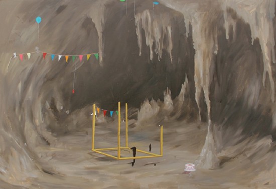
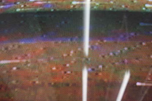
The show he organized includes work by four early-career L.A. artists. There's not much to sink your teeth into, but, for once, that's a good thing. A boxy television in the corner plays Paused Speed by Jason Hwang, an unending stream of sunset-colored static. Next to the door hangs a sleek black poster by Bobbi Woods with the word "Secrets" printed across the middle in a tousled yellow font. Wayne Atkins' painting Cave Party depicts a brownish, stalagmite-filled cavern with floating balloons, streamers and an uncut cake, suggesting a party that never actually happened.
Emily Steinfeld's installation may be the most absorbing, and flakiest, in the room. She made her own pH paper, usually used to measure acidity, substituting red cabbage as its neutral base. She wrapped the paper around a low-to-the-ground table with an awkward hole in the middle. Then she concocted "Master Cleanse Tequila," made up of cayenne pepper, lemon juice, maple syrup and tequila.
?
She'd been inspired by The Conjurer, a 15th century painting by Hieronymus Bosch, in which an important-looking man falls under the spell of a conjurer's ball, leaning in over a table and drooling slightly.
Steinfeld supplied her tequila concoction to guests at the opening, encouraging them to then drool over, or at least spit on, her table. She hadn't tested it -- flakes don't thrive on practice. But it worked, and the red and blue color of the now spittle-covered, acid-stained tabletop has held up nicely in the nearly two weeks since the opening.
"Flakey" is shtick that feels spot-on. The world is teeming with smart people with charm, ambition and no real plan, and a show that gets at that without a heavy hand is doing something right.
JB Jurve gallery is open every Saturday and by appointment. "Flakey" continues through July 18.
___________________________________________________________________________________________________
LA SEEN - June 8 2011
Jason Hwang in “Flakey” at JB Jurve
The inclusion of Jason’s Hwang’s video work Paused Speed in a group show titled “Flakey” at JB Jurve (Mike Rey’s curatorial debut) is at first glance well-deserved given its seemingly trite conceit: a DVD of the movie Speed (1994) stuck on one frame. Hwang could have presented a still from the movie but opted instead to hack a DVD player to stay fixated on one frame, thus achieving the double arrest of both the movie and the mechanism that inconspicuously moves it. The result is a blank brownish image of some interstitial moment in the nonstop action that jitters like a cooped-up tweaker and periodically breaks down into meteor-like showers of static. A potted plant atop the TV set adds an affected touch of homeliness and stasis to a presentation that begs to be dismissed as a technical glitch. Also atop the set, but easy to overlook, are three Italian 20 cent Euro pieces, each bearing a miniature relief of Boccioni’s Unique Forms of Continuity in Space. Boccioni’s association with Futurism (and its cult of speed and combat), was unheroically terminated when he was trampled by his own horse during wartime cavalry training. By stopping the hyperkinetic Speed in its tracks, Hwang forces his audience to experience a momentary jolt of withdrawal. Like the drug to which speed lent its name, the spectacle of speed hymned by Marinetti has had time to become yet another joyless addiction sustained not by the intensity it delivers but by the anxiety that it dulls. The thinness of the joke in Paused Speed is connotative of the nothingness that spectacle covers over and that only surfaces as ennui, i.e. as the desire for the very distraction of which one has been deprived. The real meaning of the joke in Paused Speed is, indeed, the joke’s weakness. In that sense, the work is very quick witted, so quick as to appear almost invisible … or flakey.
_____________________________________________________________________________
Parlor Antics - November 3 2010
Matthias Lahme: Interview with Vanessa Conte
V: A lot of people seem to doubt the existence of the nano-sculpture, “auf wiedersehen.” Do you think it’s really there?
M: Of course, I do. I believe that it’s there. I totally have to trust the great technicians and engineers at Nanoscribe.de who realized my sculpture. And, they trust the images from their Scanning Electron Microscope as proof. In the end, visitors of my show have to trust me like they should trust every other artist to not deliver any silly jokes.
The energy and mood of this piece are grounded in exactly this question.
Michael Rey said, “[it] seems to always evoke some kind of Cartesian doubt, it creates a site of rupture in belief.” I agree, but it’s not just a tiny, tiny, tiny something. It also has a form.
V: All of your work is very intimate and charismatically guides the viewer into a personal conversation with it (or you), whether it’s through your written words, or the absence of your words or the hand craftsmanship of your sculptures. Are you speaking to anyone in particular when you make the text works?
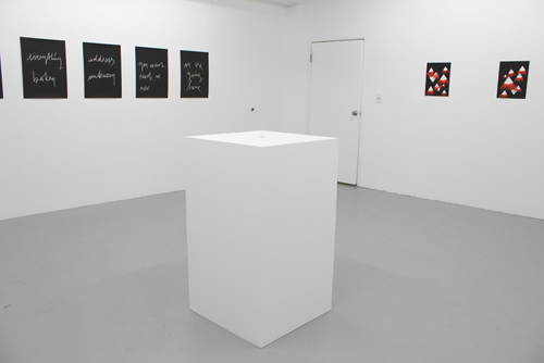
M: No. The words speak to me first. Then, I isolate these fragments out of their original context. Then the words speak for themselves. Then I paint around the written line. It’s not like something written on paper. In the end it’s painting.
V: Are the cutout works, titled Lashes, meant to be personifications of the gallery or of an invisible entity that we must believe exists, like “auf wiedersehen”?
M: No. It can be seen as an ‘association-game’ with the double meaning of “Lashes.” They are untitled, “Lashes” is just the unofficial title for this series of cutout works.
In combination with other works—especially with figurative works like “auf wiedersehen”—it creates an area of tension that comes from the will or urge of the viewer to see something ‘real.’ It’s the ambition of the human eye and brain to perceive patterns and figurations.V:.
V: When did you start clarifying that your work is about faith and belief? Is this a true or false assumption about your work?
M: It’s true. And false. It hurts me to talk about it, and to explain it too much will lock the door for others to enter into my world.
V: Who has influenced you most in your artistic development?
M: Dave Gahan
V: The lead singer of Depeche Mode. What is one characteristic that you and David Gahan share?
M: We are moved by a higher love.
V: You were included in a recent regional exhibition that categorized and named your generation of artists from the Northern Rheinland area of Germany as “Post-ironic.” Would you consider yourself rightly categorized or see this title fitting your work?
M: My works are not meant to be ironic (although they sometimes share a certain sense of humor, or let’s say a twinkle in one’s eye).
I first liked the idea of being one of those post-ironic-artists, but that means that there has been an ironic movement, which I don’t see. Curators are always relying on this categorizing, on this kind of linear history that they need as a structure. They feel helpless without that; they are obsessed with it. They trust that there is an official stream of events, artists, and movements, but we all know that there has been, and is so much more, than the official art-history in our books and magazines. And, don’t forget that these titles are very often a result of the fact that you can only raise money with a “strong idea.”
So, coming back to post-ironic: I consider it just as this common ‘proposal-language.’
V: How did you respond to the show with your installation?
M: I first urged myself not to respond at all, just to show my works. I showed 2 large, scary, black cutout monsters and an oversized rosary out of clay on the wall, which could be seen as a huge smiling face due to the coloring of the pearls, and one of my black handwriting paintings. I chose the one saying “people familiar with the matter.” When it was hanging, it suddenly looked like the subtitle of the whole show, and I totally disliked that idea.
Just a few hours before the opening I decided that I had to change it!! I replaced it with a new black handwriting painting that said: “it doesn’t matter.” Finally, that was my way of responding to the show.